A Multi-Language Data Science Architecture: Uniting Python and R in Positron IDE
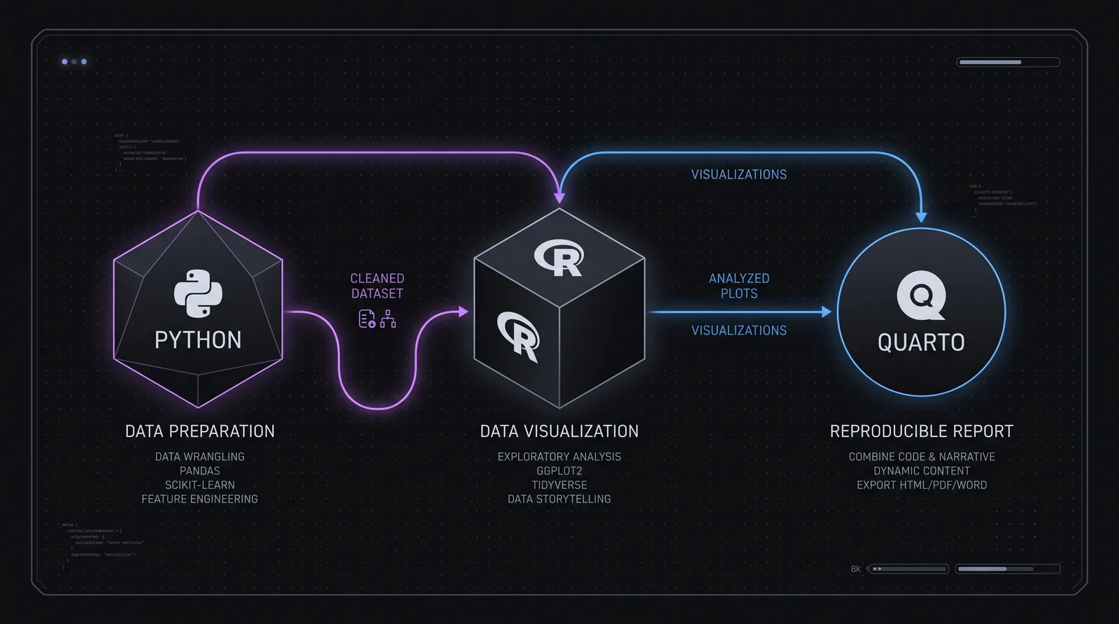
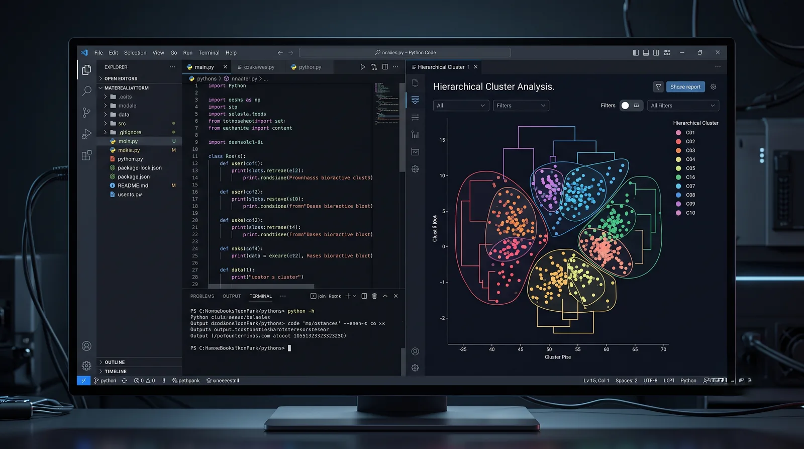
Python prepares the data, R visualises it, and Quarto binds both into one reproducible report, all inside a single IDE.
For years the data science community has run an argument that never quite ends: "Python or R?" For engineers who build complex statistical models and design architectural systems, though, the question is wrong at the root. Instead of forcing everything into a single language, why not let each language do the thing it does best?
One of the most effective methodologies to reach industry practice recently is exactly this: building multi-language workflows. In this article I want to look at how Python and R can be synchronised inside one project, using the new-generation Positron IDE in particular.
Why a multi-language workflow?
Traditionally, data scientists shut themselves inside one environment, either Jupyter Notebook for Python or RStudio for R. The reality, however, is this:
- Python is unmatched at preparing data in a scalable form and at building complex machine learning pipelines.
- R is the ideal environment for deep statistical analysis, and its layered Grammar of Graphics gives finer control over a figure than any Python plotting library offers.
Neither observation is new. What changed is that unifying the two no longer costs you the project structure: the whole ecosystem now fits under a single IDE while staying organised and reproducible.
What Positron actually contributes
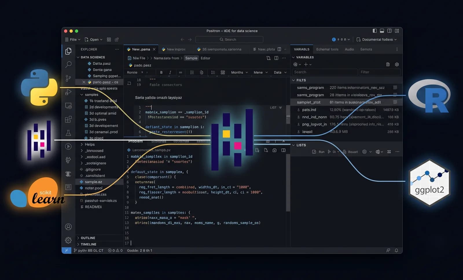
It is worth being specific here, because "use a better IDE" is the kind of advice that means nothing on its own. Positron is built by Posit on Code OSS, so the editor, the extensions and the keybindings are the ones you already know from VS Code. What it adds is that the session is a first-class concept rather than an extension setting: the interpreter picker sits in the top-level UI, the console attaches to whichever Python or R session is active, and the Variables pane and data explorer read from both without a different tool for each.
That sounds cosmetic and is not. In a VS Code and RStudio split, the friction is never the syntax, it is that inspecting a data frame means remembering which application owns it. Collapsing that into one window is what makes a genuinely multi-language pipeline practical to work in day to day, rather than something you assemble once and never touch again.
Practical implementation with Positron IDE
Let us walk step by step through how this multi-language architecture is built in a real working environment.
1. Data preparation and clustering (Python)
After pulling raw data out of the database (PostgreSQL, for example), the first stage is cleaning and preprocessing. Here we lean on Python's ecosystem, both for preparing the data and for machine learning tasks such as hierarchical clustering.
# Python: data preparation and hierarchical clustering
import pandas as pd
from sklearn.cluster import AgglomerativeClustering
from sklearn.preprocessing import StandardScaler

# Processing the data
df = pd.read_csv("raw_data.csv")
scaler = StandardScaler()
scaled_data = scaler.fit_transform(df[['feature1', 'feature2']])

# Building the cluster model
cluster_model = AgglomerativeClustering(n_clusters=3, linkage='ward')
df['cluster_id'] = cluster_model.fit_predict(scaled_data)

# Saving the result for R
df.to_csv("processed_clusters.csv", index=False)
2. Visualising the data (R and ggplot2)
Once Python has done its work, the baton passes to R to raise the visual quality of the report. matplotlib and seaborn are useful, but neither gives you the academic-grade precision and aesthetic control of R's ggplot2. This is the stage where R enters, specifically for data visualisation.
# R: data visualisation with ggplot2
library(ggplot2)
library(readr)

# Reading the data coming from Python
df_clusters <- read_csv("processed_clusters.csv")

# An academic-grade plot
ggplot(df_clusters, aes(x = feature1, y = feature2, color = as.factor(cluster_id))) +
  geom_point(size = 3, alpha = 0.8) +
  theme_minimal() +
  labs(title = "Results of the hierarchical clustering",
       color = "Cluster")
3. Producing reproducible reports (Quarto)
Presenting research or analysis results to B2B partners or to management is the decisive point of the engineering work. The era of copying and pasting code blocks is over. The whole workflow is bound together through Quarto to produce reproducible HTML reports, and Quarto can render both Python and R code blocks inside the same document.
Closing thoughts
As a data scientist you are constantly forced to switch between different languages. The architecture Positron IDE offers reduces to zero the context loss that builds up between separate tools such as VS Code, Jupyter and RStudio. Concentrating the entire workflow inside a single IDE makes moving between languages easier and keeps your projects fully reproducible and structured.
The same "microservices" logic that applies to system architecture applies to the analysis process too: instead of monolithic systems, pick the tool that does each job best and connect them with the right pipeline.